How to Choose Drapery Fabric and Color in Danville
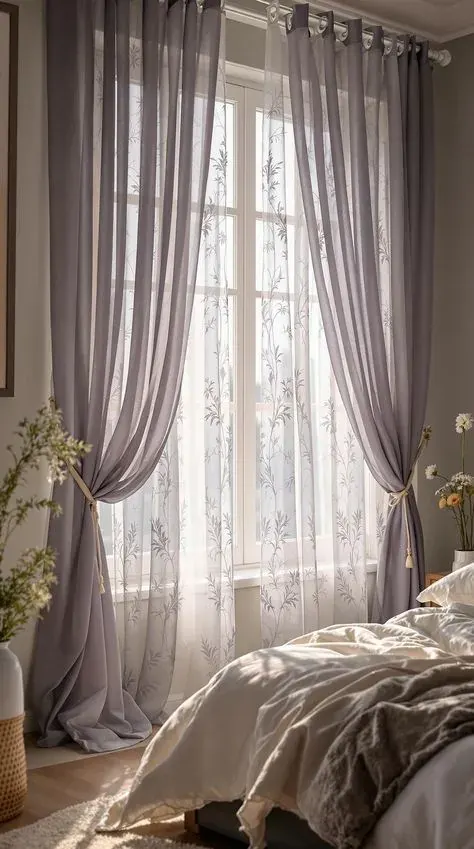
Every custom drapery order starts with two decisions that matter more than any other: what the fabric is made of, and what color it is going to be once it is hanging in actual daylight instead of under a showroom light. Get those two right and the hardware and installation are the easy part. Here is what actually goes into that decision at a Danville kitchen table, past the swatch book.
Fabric Weight and How Drapery Falls
When you're comparing fabrics, ask what the weight is in ounces per yard if the showroom has that number. It's a more honest comparison than "light," "medium," or "heavy," which get used loosely. Anything under about six ounces is going to move a lot and probably wants lining behind it. Anything over ten ounces is firmly in structured, formal territory and needs hardware built for the load.
Ask, too, whether the fabric is railroaded, meaning woven so it can run sideways across a wide window without a seam. That matters more than most people expect on a wide Danville picture window, since a seam down the middle of a panel is hard to hide once the light hits it.
Finally, ask how the fabric has performed in other installs, not in a lab. A salesperson can tell you a fiber content, but the person who measures and hangs it can tell you whether that particular weight holds a pleat after months of daily use, which is really the question you're asking.
Pattern and Texture
The mistake we see with pattern is ordering it without accounting for repeat waste, then being surprised the fabric bill came in higher than expected or that there isn't quite enough fabric to finish the last panel. Every pattern has a repeat measurement, and multi-width panels need extra yardage so the pattern lines up at the seams. Skipping that math is how a job runs short on fabric partway through.
Another common issue is choosing a directional pattern, like a stripe or a large floral with an obvious up-and-down orientation, without checking how it reads once it's actually hung and folded into pleats. A bold stripe can look completely different distributed across pleat folds than it does laid flat on a table, sometimes looking busier, sometimes looking almost solid depending on the fold spacing.
We've also seen texture chosen purely by hand feel in the showroom, without considering how it looks from across the actual Danville room. A nubby linen that feels wonderful up close can read as a plain, slightly rough solid from ten feet away, which is sometimes exactly right and sometimes not what the homeowner pictured.
Fullness and the Hardware Behind It
Fullness is where people accidentally cut corners to save money, and it's usually the wrong place to cut. Going from two and a half times fullness down to one and a half times can look like a modest fabric savings on paper, but the finished panel looks thin and cheap regardless of how much the fabric itself cost per yard. It's often better to choose a less expensive fabric at full fullness than an expensive fabric skimped down.
Hardware is the other spot where saving money upfront costs more later. A budget rod that isn't rated for the actual weight of a lined, full panel will sag in the middle within a year, and at that point you're either living with a bowed rod or paying to replace it, on top of what you already spent on fabric.
For Danville homeowners working with a set budget, we'd rather see the fabric grade come down a notch than the fullness or the hardware quality. Those two things are what make a panel look intentional instead of thrown up, and they're expensive to fix after the fact.
Most fabric and color regrets trace back to a decision made without seeing the material in the actual room. Booking a free in-home measure lets you catch weight and lining issues before anything is cut, which is a lot easier than fixing them after.
Color and Sun Exposure
Color should get chosen against what's already fixed in the room: the flooring, the wall color, the cabinetry, and any large upholstered pieces. A warm wood floor with yellow or orange undertones fights a cool blue-gray drapery in a way that's hard to notice on a swatch card but obvious once the whole room comes together. Bring a flooring sample or a paint chip along when you're looking at fabric, not just a photo on a phone.
Rooms with a lot of natural texture already, like exposed brick or heavy timber beams, generally do better with a simpler solid drapery so the window isn't competing with everything else going on in the space. Rooms that are more neutral and minimal can carry a bolder color or a subtle pattern without feeling busy.
A lot of Danville homes we work in have big west-facing windows in the main living space, and that's exactly where we push people to consider a fiber that resists fading, since that's the wall in the house that's going to show sun change first no matter what color gets chosen.
Light Control and Lining Options
Lining does two main jobs: it controls how much light comes through, and it protects the face fabric from daily sun on the back side. It also gives the panel a cleaner look from the street, since passersby otherwise see the underside of the fabric's seams. Standard cotton sateen lining knocks down glare and adds a bit of privacy without going fully dark.
Blackout lining is a different animal, usually a foam-coated or knit-backed layer bonded to the lining that blocks nearly all direct light through the fabric itself. The word "nearly" matters. Drapery isn't built into a sealed track the way a cellular shade is, so even a true blackout panel lets a strip of light leak in around the edges and at the top where the rod sits.
If a bedroom needs the room fully dark, we usually pair blackout drapery with a shade mounted inside the window frame behind it, rather than relying on the drapery panel alone to seal the room. For most Danville living rooms, a middle-weight lining is the right call, enough body and light control without turning the room into a cave.
Frequently Asked Questions
How do I know if a fabric is heavy enough for my window?
There is no single number that works for every window, but as a rough guide, anything under about six ounces per yard is going to move a lot and probably wants lining behind it for body. Wider windows and taller ceilings generally look better with a heavier, more structured fabric, while smaller windows can carry something lighter without looking skimpy.
Should I pick the fabric first or the color first?
Fabric type first, in most cases. The fiber content and weave affect how any color actually reads once it is hanging, sometimes softer, sometimes more saturated, so choosing color against a specific fabric sample is more reliable than picking a color in the abstract and hoping to find it in the right weight and construction later.
Do darker colors really show more wear than lighter ones?
They show different wear, not necessarily more. Dark, saturated colors show dust and uneven fading more visibly than mid-tones do, while very pale colors show soiling at the leading edge and hem faster. A mid-tone with some texture in the weave tends to hide normal daily wear better than either extreme.
 Outfitting a Danville Apartment Building With Window Coverings
 Where Roller Shades Belong in a Danville House, Room by Room
 Living With Motorized Shades in a Danville Home